TBWA Unveils New Visual Identity As Its Collective Enters Next Phase
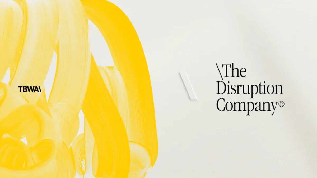
TBWA has introduced a redesigned visual identity, developed by its global design discipline DXD, as the network's Collective enters what it calls its next phase.
- Network: TBWA
- Design discipline behind the identity: DXD
- Collective members: TBWA\Chiat\Day, adam&eveTBWA, TBWA\Media Arts Lab, TBWA\HAKUHODO, LOLA, Africa
- Identity elements: hand-crafted iconography, brushwork, a reintroduced serif typeface, a new monogram, a second colour ("Analog") alongside TBWA's existing yellow
- Built-in flexibility: 20% design latitude for local market customisation
Imperfection As A Design Principle
The new identity leans deliberately toward hand-crafted, imperfect finishes, brushwork and handwritten elements, a serif typeface and a new monogram, over the cleaner, more uniform system it replaces. Bruno Regalo, Global Chief Design Officer, said, "Our job isn't to create assets. It's to build visual systems so distinctive people recognize the brand before seeing its logo," framing the redesign as an attempt at recognisability through texture and character rather than a fixed logo mark alone.
A System Built To Flex Across Markets
The identity pairs TBWA's existing yellow with a new colour the network calls "Analog," drawing on stationery, vintage envelopes and Leica photography, alongside photography that favours authentic moments over posed shots, bespoke backslashes and passport-inspired city stamps. Notably, the system builds in 20% design flexibility for local market customisation, an explicit acknowledgment that a single global identity applied identically across TBWA\Chiat\Day, adam&eveTBWA, TBWA\Media Arts Lab, TBWA\HAKUHODO, LOLA and Africa would flatten differences the network wants to keep. Peter Khoury, Chief Creative Officer at TBWA\Singapore, said design should reflect "culture-fluid thinking and design-led principles applied across the ecosystem," while Russell Barrett, Chief Creative Experience Officer at TBWA\Lintas, said, "A brand's design is its first expression of its strategy."
More on Ad Tribe News.