vial: A Modular Identity System for Everyday Wellness
A multivitamin packaging and identity project that reimagines supplement packaging as a designed system, prioritising consistency over intervention.
- Client
- vial
- Studio
- Presentable
- Disciplines
- Brand identity, packaging, information design
- Location
- Gurugram, India
- Year
- 2026

vial is a multivitamin packaging and identity project designed by Presentable, an independent design studio based in Gurugram, India. It reimagines supplement packaging as a designed system that prioritises consistency over intervention. Rather than positioning supplements as corrective or clinical, the project frames daily nutrition as an integrated ritual: accessible, structured, and enduring.
What vial Is Moving Away From
Supplement packaging often leans on urgency, clinical signals, or aspirational lifestyle cues, frequently resulting in visual clutter and exaggerated promises.
Conventional products rely on pharmaceutical visual codes (clinical typography, saturated colour palettes, bold efficacy claims, and urgency-driven messaging) to signal potency and justify purchase. While effective at communicating authority, these cues frame supplements as corrective interventions, encouraging episodic use tied to perceived deficiency rather than sustained daily practice. The visual language positions the product as a response to something wrong, reinforcing a reactive model of health in which consumption begins and ends with the problem.
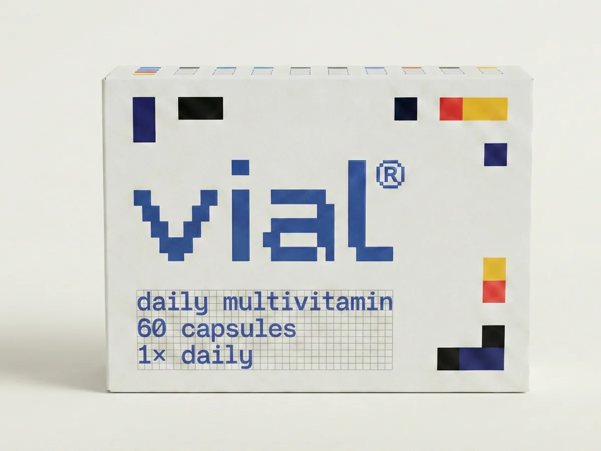
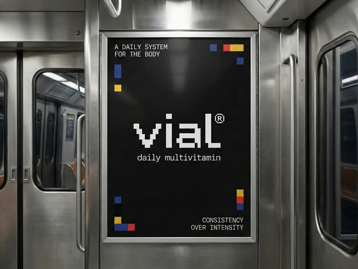
That approach was built for a moment that matters less each year. Packaging was always designed for the three seconds of the shelf grab, and for that moment, louder worked. But health and beauty are now lived with rather than glanced at, seen daily at the bathroom counter and the bedside shelf, and consumed as ritual on Instagram: morning routines, shelfies, restocks. A pack that shouts can win a second at the store shelf; on a counter, it feels out of place. Quiet is what people can live with, and be seen living with.
Quiet, looked at closely, is really logic.
vial deliberately moves away from this paradigm through a minimal, system-led identity that replaces urgency with order. Built on a rational modular grid, restrained typography, and colour used as information rather than persuasion, the design shifts attention from promises to process. Each geometric unit represents a nutrient within a larger compositional whole, visually reinforcing the idea that wellbeing is cumulative and interdependent rather than singular or dramatic. By reducing visual noise and foregrounding legibility, balance, and repetition, the packaging reframes supplements as stable tools for maintenance rather than emergency solutions.
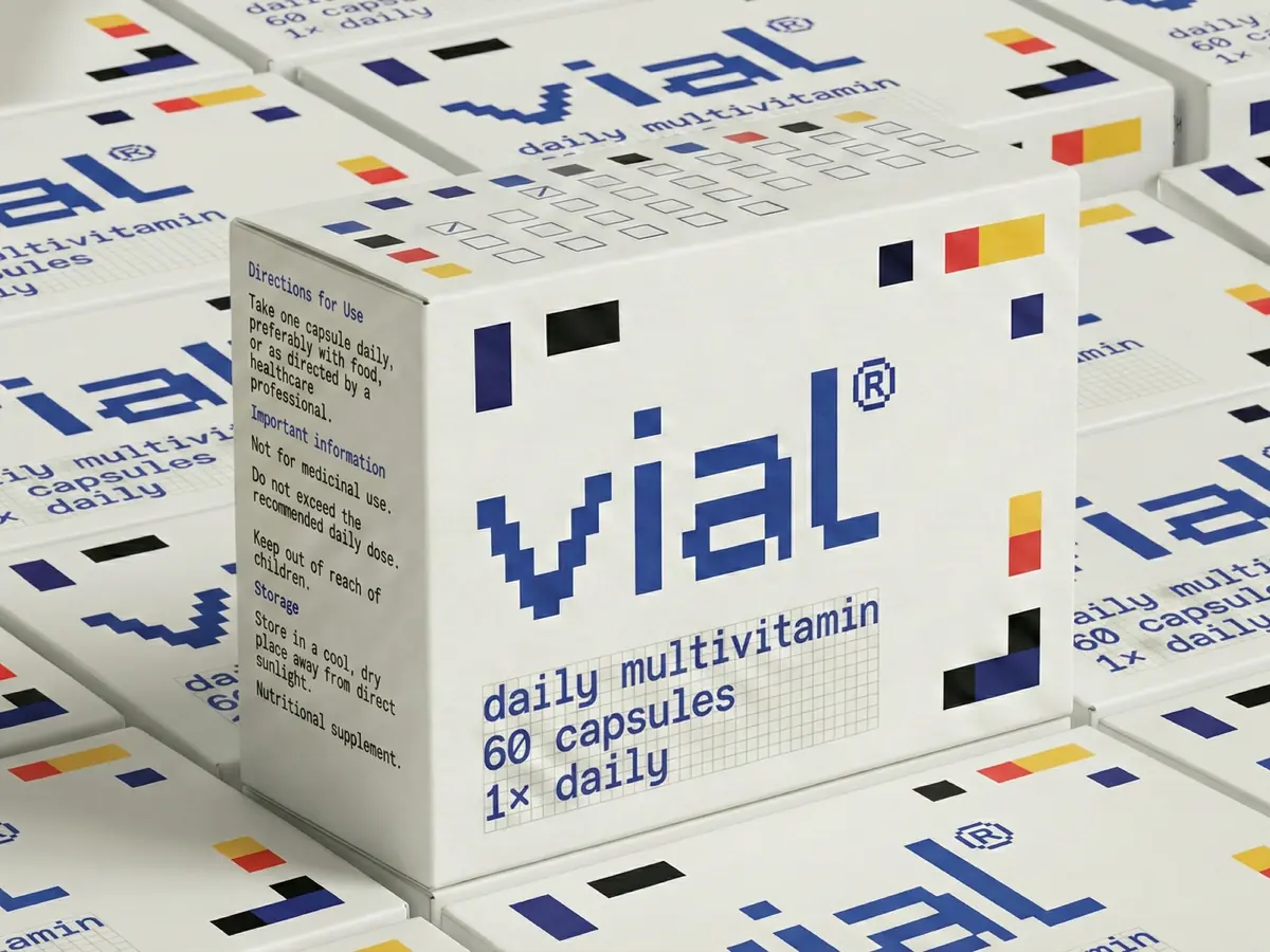
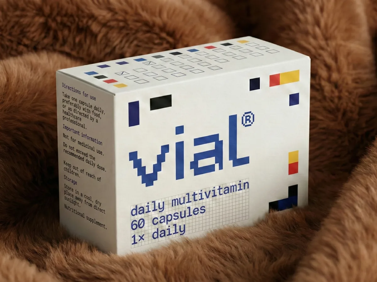
The grid extends beyond composition into behaviour. Integrated checkboxes allow users to mark daily intake, transforming the package from a passive container into an interface that makes routine visible. This interaction supports consistency, encouraging adherence through gentle reinforcement rather than motivational pressure. Trust is built through clarity and transparency rather than intensity, positioning the product as a dependable presence within everyday life.
This shift reflects a broader cultural movement away from aspirational or corrective wellness toward preventative, self-directed care. Comparable tendencies can be observed in contemporary beauty brands such as The Ordinary, whose restrained, information-led packaging replaced transformation-driven narratives with ingredient transparency and disciplined routine. While operating in a different category, such approaches signal a growing preference for products that support ongoing maintenance rather than dramatic intervention.
Against this backdrop, vial proposes a quieter alternative, treating wellness not as something dramatic or corrective, but as something steady and cumulative. Quiet, looked at closely, is really logic: people increasingly want products that explain themselves, where every element has a reason, rather than products that perform.
Modernist Structure in an Everyday Context
At its core, the identity brings modernist abstraction into the medicine cabinet.
That modernism is not an import. In 1957, the Government of India invited Charles and Ray Eames to advise on design in the country, troubled by the declining design of consumer goods. Their 1958 report championed an attitude of every quality serving a purpose, illustrated most famously through the lota, the everyday vessel perfected by generations of use, and it seeded the National Institute of Design. Purpose-led design is an Indian inheritance; vial applies that method to a contemporary consumer object.
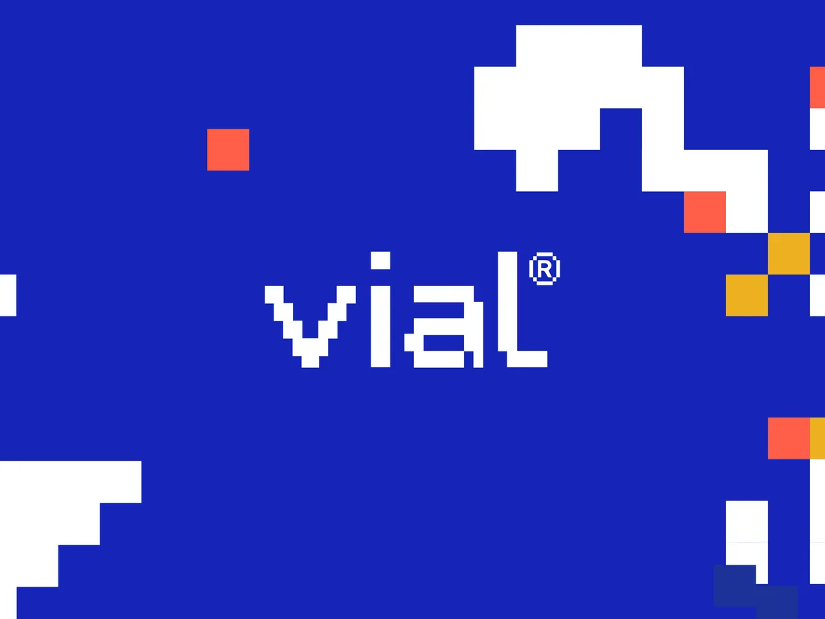
The visual system is built on a rational modular grid where routine becomes composition and balance is formed through repetition.
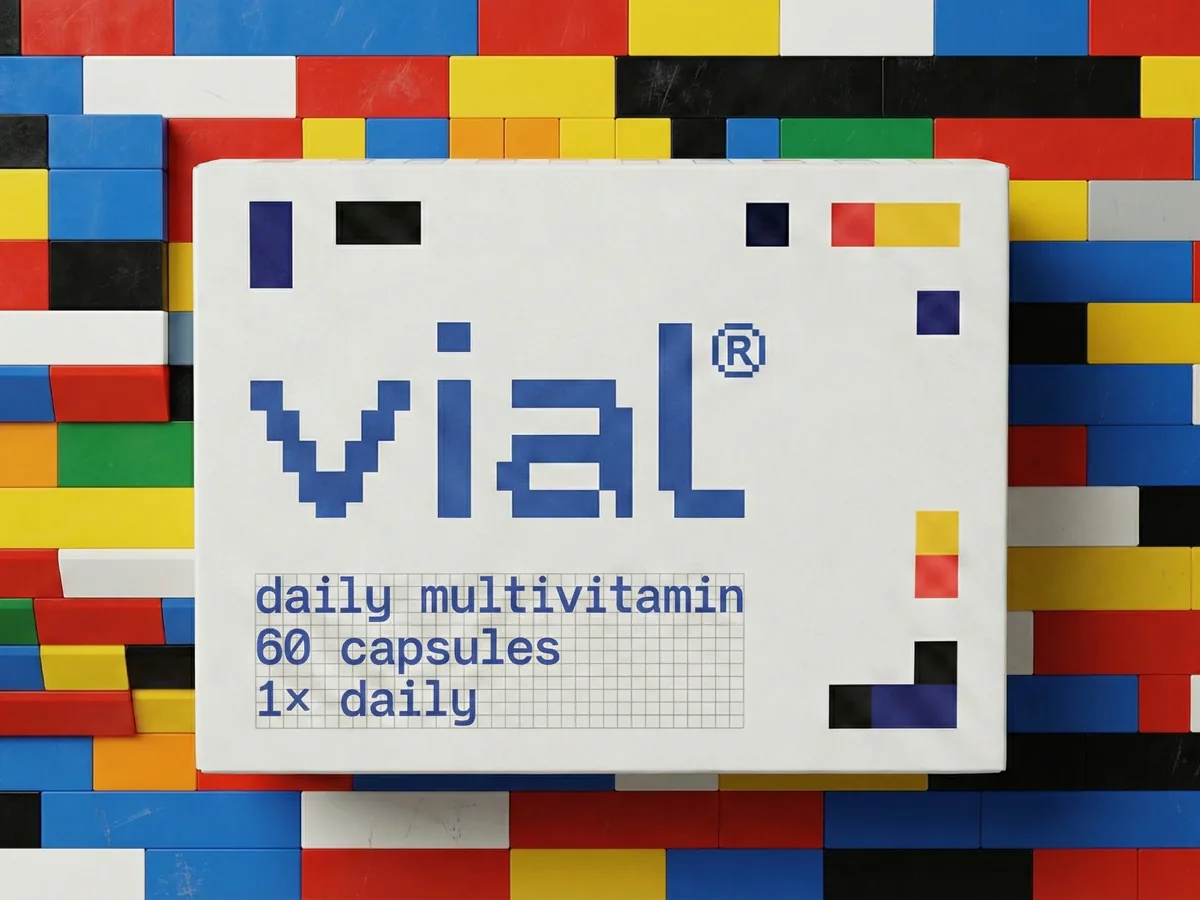
Inspired by the compositional clarity of Piet Mondrian and the modular stacking logic of Tetris, each geometric unit represents an individual nutrient, distinct yet always part of a larger whole. Elements align, stack, and occasionally fall away, reflecting absorption, shifting needs, and the understanding that wellness is not a fixed end state but something continuously adjusting.
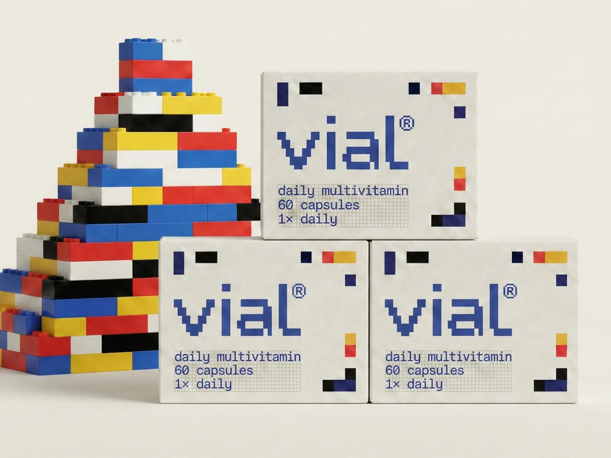
The same modular grid structure informs the construction of the vial logotype, ensuring the mark and the wider visual language emerge from a shared underlying system rather than decorative styling.
A System Across Structure, Colour, and Type
The graphic system operates across structure, colour, and typography. Colour functions as an informational layer, with each hue representing a specific nutrient, allowing differentiation while preserving systemic cohesion. The restrained palette supports clarity without overwhelming the visual field.
Typography remains neutral and controlled, supporting hierarchy and legibility without competing with the geometric framework. Together, these elements create a flexible yet coherent packaging range where order and consistency guide recognition.
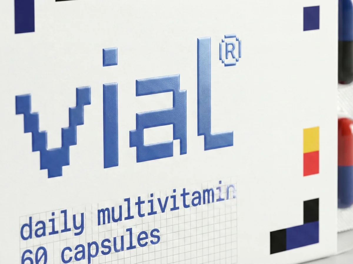
Solid forms convey stability and nutritional integrity, establishing trust through visual weight and clarity. Irregular edges and deliberate gaps introduce organic variation, acknowledging the body’s dynamic needs and the flexibility required to support long-term wellness. This interplay between precision and adaptability positions vial as both systematic and human-centred.
From Composition to Use
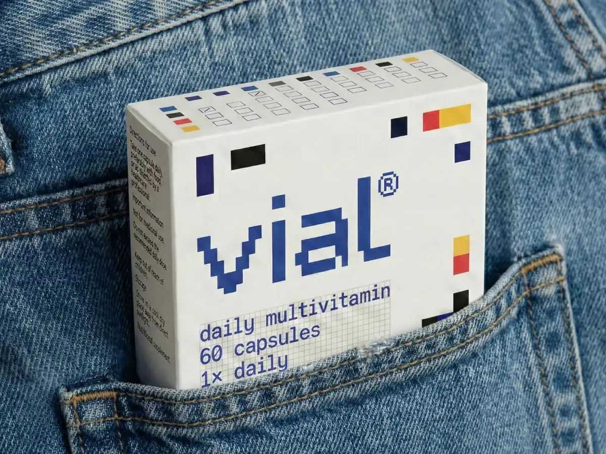
The packaging surface becomes a grid-based interface: rational, honest, and quietly confident. The grid extends beyond visual composition into interaction. Integrated checkboxes allow users to track daily intake, turning the box into a small ritual object.
This connection between graphic order and everyday use places the identity system within a behavioural context. Routine becomes visible, and progress becomes part of the visual language itself.

Normalising Wellness Through Design
Rather than dramatising wellness, vial normalises it through structure and repetition. The project sits at the intersection of visual identity, packaging design, user experience, and information design, expressed through a modular graphic language applied across a consumer category.
Structure becomes the primary expression of care. Balance becomes the visual metaphor for health. Consistency becomes the design language of wellbeing.
Like the lota, nothing on the object is decorative: every element earns its place, and every element can explain why it is there.
What the System Adds Up To
Read as a whole, vial is an argument about where packaging design now has to work. The shelf is no longer the only room the pack has to win, and a design built entirely for that room has been solving for a moment that keeps shrinking.
What replaces it is harder to do and easier to live with: an object that has to survive being looked at every morning for sixty days. That is a durability problem rather than an attention problem, and it rewards different things: order over volume, information over claim, a surface that gives the owner something to do rather than something to believe.
Routine becomes visible, and progress becomes part of the visual language itself.
The checkbox is the smallest element on the pack and the one that carries the argument furthest. It costs nothing, it makes no promise, and it turns a container into a record of whether the thing inside is actually being used. That is the whole thesis in a printed square: care expressed as structure, and trust earned by being clear rather than by being loud.