Black Poetry Gets Its Carbonated Coffee Identity From OPEN Strategy & Design
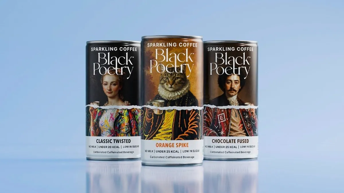
Black Poetry has worked with OPEN Strategy & Design on the brand world for its carbonated coffee, one of the first entries into a category that barely exists in India yet.
- Brand: Black Poetry, premium coffee, entering carbonated ready-to-drink
- Partner: OPEN Strategy & Design, an independent brand design and transformation consultancy
- Scope: brand positioning, packaging design, visual identity system, communication framework
- Creative idea: "beautiful vandalism", built on the line "Coffee, Reimagined"
- Spokespeople: Rahul Goel, Founder, Black Poetry; Asparsh Sinha, Managing Partner, OPEN Strategy & Design
The Problem With Being First
Most brand work involves positioning against something. A new toothpaste knows what the shelf looks like. Carbonated coffee in India has no shelf to position against, and the two obvious reference points both pull the wrong way.
Borrow from speciality coffee and you inherit ritual, craft and seriousness, which fights a fizzy drink in a can. Borrow from conventional ready-to-drink and you become another cold beverage, which throws away the coffee credential the product is actually built on. Black Poetry had to be legible as coffee while looking nothing like coffee.
"Beautiful Vandalism"
The idea OPEN landed on treats irreverence as the point rather than the decoration, arguing that jazz, hip hop, street food and contemporary art all arrived by breaking a rule on purpose. Sinha was specific about where that lands:
"Emerging categories rarely succeed by borrowing the language of established ones. Carbonated coffee needed a distinctive voice and a visual world that reflected its unconventional nature."
Naming a philosophy is the easy half, and plenty of decks have died there. What makes this one testable is that it had to survive contact with a specific object.

Black Poetry Treats The Can As A Media Channel
The most useful line in the whole exercise is OPEN's decision to treat the can as media rather than as a container. For a product nobody has heard of in a category nobody has tried, the packaging is not the last touchpoint in the funnel. It is the entire advertising budget, sitting on a crowded shelf with about a second to work.
Goel described the brief in those terms, saying the company needed a brand that could hold its own in a category with no existing rules rather than a package design.

That reframing has a real consequence: it changes who signs off the can and against what standard. A container is judged on shelf compliance and legibility. A media channel is judged on whether it stops someone. Those two reviews reject different designs.
The Part That Is Still Unproven
Everything here is a bet on a category forming. Carbonated coffee has had false starts in other markets, and India's cold coffee habit is already well served by bottled and canned formats that do not fizz.

If the category arrives, being early with a fully built brand world is a strong place to stand. If it stays a curiosity, the identity work will have been correct and the timing wrong, which is a distinction the market does not usually pay much attention to.
More on Ad Tribe Brands.